
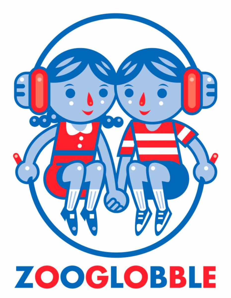
Hopefully you're seeing a fancy new logo up there at the top of the page and down a bit along the right-hand side of the link bar. Isn't it pretty? I think so (though I probably need to increase the resolution a bit).
When I first started thinking about getting a professionally done logo to replace my own poorly-crafted one, for a variety of reasons the first name that came to mind was that of
Brandon Reese. I knew there was a lot of talent in the kids music field -- Billy Kelly, for example, or Kevin Kameraad, not to mention musicians with a nice eye for design, such as Frances England. But Brandon was definitely my first choice.
You're probably familiar with Reese's work -- he's designed album covers for
Lunch Money and
The Jellydots, not to mention a bunch of games and other stuff for eeBoo. (And I interviewed him
a little more than a year ago.)
He has a sense of whimsy and play along with a strong design sense, two things I wanted to convey with this new logo, and I think he nailed it. That logo on the right is what I like to think of as the main logo, the one that if I were to
sell all sorts of stuff would be plastered all over it. (Anybody need a
men's organic t-shirt?) But it's got a very portrait orientation and sometimes I'm all landscape-y, so Reese designed a second logo that incorporated part of that first logo...

Anyway, I'm very happy with the logo. Thanks to
Brandon for taking some pretty vague design concepts and turning them into something with a virtually no fuss. If you want to learn a little bit more about the design process for this logo and Reese's next projects, read on...
 Zooglobble: How did you become an illustrator (e.g., what did you draw growing up? where did you get your training, etc.?)
Brandon Reese: I think I always drew. My mom and brother are a big reason for that. When my brother and I were little, my mom read somewhere that in order to foster creativity in your children, you shouldn't give them coloring books but blank pieces of paper instead. My brother always drew and I wanted to be as good as him, so I was constantly practicing.
As far as training, the first formal art class I'd ever taken was in college. Reason being, I went to small private schools my whole life, none of which really had any arts programs. I'm sure if you could find my old school books you'd see doodles on most of the pages. I distinctly remember getting in trouble in the 6th grade for drawing in my textbook and my teacher calling me "morbid." (I was really into skulls and skeletons back then.)
(chicken- by Brandy, age 5)
Zooglobble: How did you become an illustrator (e.g., what did you draw growing up? where did you get your training, etc.?)
Brandon Reese: I think I always drew. My mom and brother are a big reason for that. When my brother and I were little, my mom read somewhere that in order to foster creativity in your children, you shouldn't give them coloring books but blank pieces of paper instead. My brother always drew and I wanted to be as good as him, so I was constantly practicing.
As far as training, the first formal art class I'd ever taken was in college. Reason being, I went to small private schools my whole life, none of which really had any arts programs. I'm sure if you could find my old school books you'd see doodles on most of the pages. I distinctly remember getting in trouble in the 6th grade for drawing in my textbook and my teacher calling me "morbid." (I was really into skulls and skeletons back then.)
(chicken- by Brandy, age 5)


